SANDMARC
Enabling photographers, filmmakers & travelers capture next-level content.
SANDMARC
-
The Challenge
To create a more user friendly website that is accessible & easy to navigate through. To reconnect existing as well as new customers with the brand.
-
The Solution
After thorough user research and looking at the data it was determined that our existing site was not user friendly. Based on the research the team and I have established our user’s main pain points.
User Pain Points:
Website is very complex and hard to find the product user’s need.
The menu has too many options to choose from & Is overwhelming.
First time user’s/customers don’t understand or know what products is right for them.
The solution is to focus on creating a new website focusing on solving those pain points.
-
The Role
UX Designer.
-
Duration
2 - 4 weeks
Rebranding SANDMARC’s Mission Statement
Who Are We
We're in the business of creating products that last a lifetime. We seek to enable photographers, filmmakers & travelers capture next-level content. Based in San Diego, California.
SANDMARC started in the GoPro space and then transitions to creating products for iPhone photography & filmmaking. While the previous statement is still true, SANDMARC has grown since then. Incorporating new products to really help creators do what they do best, create!
It was time for a new mission statement.
SANDMARC’s New Mission Statement
Rebranding Project
User Flow Redesign
The user experience from SANDMARC’s previous homepage and navigation menu was not a pleasant experience, which needed to be redesigned. User’s found the navigation menu to be overwhelming and difficult to navigate through. In collaboration with the research team we implemented a categorized structure within the menu to illustrate each product. We also added a separate section for “Devices” on its own for users to simply search based off of the device their intending to shop for.
Original Site’s Navigation Menu
Redesign
A new page has been implemented based off of the new categorized system in the menu. User’s want to have straightforward clicks that lead to their desired goal and not have to scroll endlessly or search for it. A “why we made this” was also implemented because it tells the user what exactly this product is and who it was made for. Giving them one more chance to know if this is the right product for them.
Simple changes such as adding a horizontal scroll instead of a vertical scroll can make a huge different in the user’s experience of finding their device. As well as a change in background color to make the important elements on the page pop out for the user to focus on.
Product Page - Redesign
Lo-Fi wireframe of SANDMARC’s product page
SANDMARC’s previous product page needed to be redesigned for a better user experience.
Some of SANDMARC’s products have some color or type variations. The previous product page had a drop down menu that involved more clicks for users to get to the product they want. The new web design eliminates that process allowing user’s to see all the variations and simply click their desired choice.
Product Page (Leather Collection) - Redesign
Leather Collection Product Page (Previous Design)
With SANDMARC's latest launch of products from the leather collection, it was designed for people to have a matching set for their apple products. The existing product page design needed to improved in order to provide a better user experience for people who wanted to purchase or view more than item from the collection.
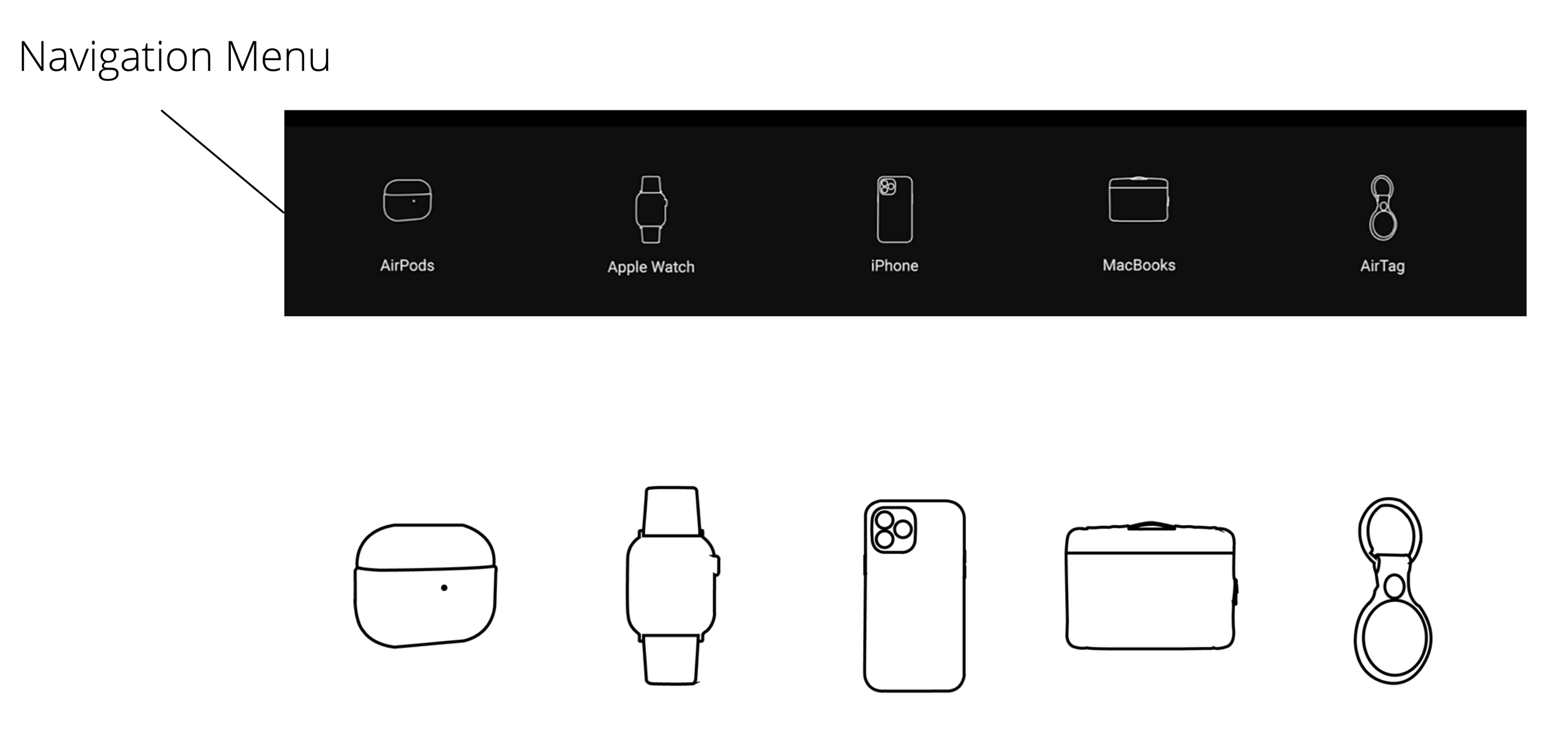
The icons were individually created on illustrator to showcase SANDMARC’s leather product for each Apple device.
I chose a simple wireframe illustration for the icons, because i believe in the power of simplicity.
The outline of the icons were designed to be in white on a charcoal background, in order for them to stand out & align with the brand.
Leather Collection Product Page Redesign
SANDMARC started off with one leather product that is the leather pro case for iPhone. However that collection grew into multiple leather gear for Apple products. It was discovered that user’s wanted to purchase more than one leather product and have a matching set for their Apple products. Giving users the option to easily navigate between other leather products in the product page has allowed users to easily add them to their cart.
Incorporating the navigation menu of products has eliminated the number of clicks most users would have to go through if they wanted to view or add more products to their cart.


